VNumberEntry
Numeric entry component that only allows standard numeric values within a defined range.
Basic Usage
Basic usage of the numeric entry component

<control:VNumberEntry></control:VNumberEntry>
Value
Set Value to specify the current value of the numeric entry box.

<control:VNumberEntry Value="50"></control:VNumberEntry>
Step Increment
Allows defining step increment control. Set Digits to specify the decimal precision of the step. The default is 0, meaning integer steps.

<control:VNumberEntry Digits="2"></control:VNumberEntry>
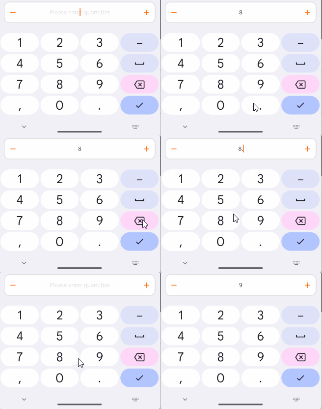
If the current input precision exceeds the Digits property, it will be rounded accordingly.
Maximum Value
Set Maximum to specify the maximum value of the numeric entry box. The increment button and input value cannot exceed this value. The default is 100.

<control:VNumberEntry Maximum="10"></control:VNumberEntry>
Minimum Value
Set Minimum to specify the minimum value of the numeric entry box. The decrement button and input value cannot go below this value. The default is 0.

<control:VNumberEntry Minimum="10"></control:VNumberEntry>
Disabled State
Disables the control.
Set the IsEnabled property to False.

<control:VNumberEntry IsEnabled="False"></control:VNumberEntry>
Placeholder Text
Set EntryPlaceholder to specify the placeholder text content.

<control:VNumberEntry EntryPlaceholder="Please enter quantities"></control:VNumberEntry>
Read-Only State
Makes the text entry box read-only.
Set the EntryIsReadOnly property to True.
<control:VNumberEntry EntryIsReadOnly="True"></control:VNumberEntry>
Custom Content
Use ContentSlot to set suffix content in the entry box.

Suffix with an icon and text:
<control:VNumberEntry>
    <control:VNumberEntry.ContentSlot>
        <HorizontalStackLayout HeightRequest="20">
            <Image Source="aze.png"
                HorizontalOptions="Center"
                VerticalOptions="Center"></Image>
            <Label Text="Calories"></Label>
        </HorizontalStackLayout>
    </control:VNumberEntry.ContentSlot>
</control:VNumberEntry>