Built-in Styles
Description
The functionality of the V-Control components does not rely on global styles. Global styles only provide some basic and commonly used styles. Styles without a specified Key attribute will override your global styles.
The resource dictionary path for global styles is:
.\src\Resources\Styles\VControlGlobalStyles.xaml
Default Button Style
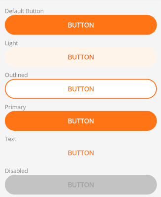
The default button style provides a themed background color and text color.
It also provides the following button style resources:
- PrimaryButton - Basic button
- TextButton - Text button
- OutlinedButton - Outlined button
- LightButton - Light button (light background color)
The default button modifies the style when in a disabled state.
Default Border Style

The default Border style provides a background color and border color.
Default CheckBox Style

The default CheckBox style provides a foreground color based on the primary color.
Default RadioButton Style

The default RadioButton style provides a foreground color based on the primary color.
Default RadioButton Style

The default RadioButton style provides a foreground color based on the primary color.
Default Picker Style
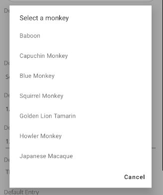
The default Picker style makes some style modifications to the native component.
Default DatePicker Style
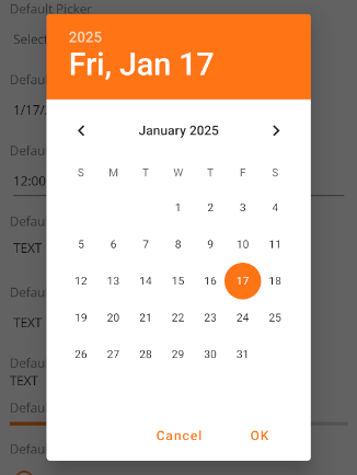
The default DatePicker style makes some style modifications to the native component.
Default TimePicker Style
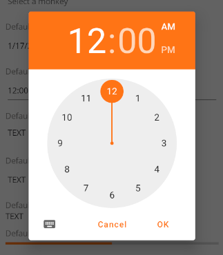
The default TimePicker style makes some style modifications to the native component.
Default Editor Style

The default Editor style removes the border and background color of the native component, while adding text color and placeholder color.
Default Entry Style

The default Entry style removes the border and background color of the native component, while adding text color and placeholder color.
Default Label Style

The default Label style modifies the text color.
Default ProgressBar Style

The default ProgressBar style modifies the progress bar color and background color.
Default RefreshView Style

The default RefreshView style modifies the foreground color of the circular progress bar during refresh, based on the primary color.
Default SearchBar Style

The default SearchBar style modifies the text color and placeholder color.
Default Slider Style

The default Slider style modifies the progress bar color and background color.
Default SwipeView Style

The default SwipeView style modifies the text color and background color.
Default Shell Style


In Shell applications, the default Shell style modifies the Tabbed icon, text color, and background color, as well as the TabBarTitle text color and background color.