VCheckBox
Selection unit in a multi-selection control
Basic Usage
Basic usage of CheckBox.

<control:VCheckBox Title="CHECKBOX LABEL"></control:VCheckBox>
Use the IsChecked property to set whether it is selected. This property supports two-way data binding.

<control:VCheckBox Title="CHECKBOX LABEL" IsChecked="True"></control:VCheckBox>
Disabled State
CheckBox in a disabled state.
Set the IsEnabled property to False.

<control:VCheckBox Title="CHECKBOX LABEL"
                    IsEnabled="False"></control:VCheckBox>
Indeterminate State
Set the IsIndeterminate property to True to indicate an indeterminate state for the CheckBox. Note: The IsIndeterminate property only changes the control's appearance and does not affect the IsChecked state.
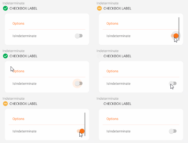
<control:VCheckBox Title="CHECKBOX LABEL"
                    IsIndeterminate="True"></control:VCheckBox>
Changing Icons
Set the IconText property to specify an icon. The icon format can be a Unicode character or an icon name. The default value is \uF068.

<control:VCheckBox Title="CHECKBOX LABEL"
IconText=""
IsChecked="True"></control:VCheckBox>
Custom Content
You can set the ContentSlot property to define custom content for the CheckBox. Setting this property overrides the default CheckBox icon.
CheckBox with an icon

<control:VCheckBox Title="CHECKBOX LABEL">
    <control:VCheckBox.ContentSlot>
        <Image Source="aze.png"
                HorizontalOptions="Center"
                VerticalOptions="Center"></Image>
    </control:VCheckBox.ContentSlot>
</control:VCheckBox>