VButton
Commonly used action button.
Basic Usage
Basic button usage

<control:VButton TitleText="BUTTON"></control:VButton>
Styles
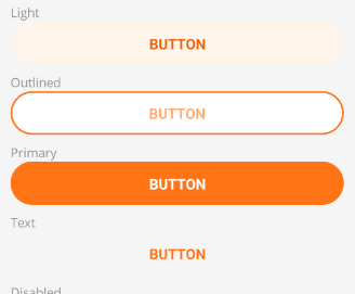
Use the ButtonStyle property to control the button style type.
The control provides the following button types:
- Primary - Basic button
- Text - Text button
- Outlined - Outlined button
- Light - Light button (faint background color)
<control:VButton TitleText="BUTTON"
                 ButtonStyle="Light"></control:VButton>
<control:VButton TitleText="BUTTON"
                 ButtonStyle="Outlined"></control:VButton>
<control:VButton TitleText="BUTTON"
                 ButtonStyle="Primary"></control:VButton>
<control:VButton TitleText="BUTTON"
                 ButtonStyle="Text"></control:VButton>
Disabled State
Set the IsEnabled property to False.

<control:VButton TitleText="BUTTON"
                    IsEnabled="False"></control:VButton>
Busy State
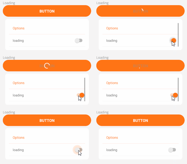
Set the IsBusy property to True.
<control:VButton TitleText="BUTTON"
                    IsBusy="True"></control:VButton>
Custom Content
You can set the ContentSlot property to customize the button content. Setting this property will override the default button text.
Button with icon

<control:VButton WidthRequest="92"
HeightRequest="92">
<control:VButton.ContentSlot>
<Grid>
<Label TextColor="{StaticResource OnPrimary}"
HorizontalOptions="Center"
VerticalOptions="Center"
FontSize="{StaticResource HeaderFontSize}"
FontFamily="FontAwesome-Solid"
Text=""></Label>
<Label TextColor="{StaticResource OnPrimary}"
FontAttributes="Bold"
HorizontalOptions="Center"
VerticalOptions="End"
Text="BUTTON"></Label>
</Grid>
</control:VButton.ContentSlot>
</control:VButton>
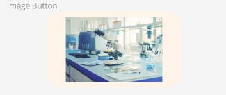
Image button
<control:VButton>
    <control:VButton.ContentSlot>
        <Image Source="service3.jpg"></Image>
    </control:VButton.ContentSlot>
</control:VButton>
Tile-style button

<control:VButton ButtonBackground="#0C3F93">
    <control:VButton.ContentSlot>
        <Grid>
            <Image Source="doc.png"
                   Margin="20"
                   HorizontalOptions="Center"
                   VerticalOptions="Center"></Image>
            <Label  TextColor="{StaticResource OnPrimary}"
                    HorizontalOptions="Start"
                    VerticalOptions="End"
                    Text="Word"></Label>
        </Grid>
    </control:VButton.ContentSlot>
</control:VButton>
FAB button

<control:VButton Grid.Column="0"
HeightRequest="82"
WidthRequest="82"
ButtonBackground="{StaticResource SecondaryContainer}">
<control:VButton.ContentSlot>
<Label TextColor="{StaticResource OnSecondaryContainer}"
HorizontalOptions="Center"
VerticalOptions="Center"
FontSize="{StaticResource HeaderFontSize}"
FontFamily="FontAwesome-Solid"
Text="+"></Label>
</control:VButton.ContentSlot>
<control:VButton.Shadow>
<Shadow Brush="Black"
Offset="0,1"
Radius="2"
Opacity="0.3" />
</control:VButton.Shadow>
</control:VButton>
Navigation bar button

<control:VButton ButtonStyle="Text"
HeightRequest="92">
<control:VButton.ContentSlot>
<Grid RowSpacing="0"
RowDefinitions="1.3*,1*">
<Border StrokeShape="{StaticResource MediumRoundRectangle}"
StrokeThickness="0"
BackgroundColor="{StaticResource Gray200}">
<Label TextColor="{StaticResource OnSurface}"
HorizontalOptions="Center"
VerticalOptions="Center"
FontSize="{StaticResource HeaderFontSize}"
FontFamily="FontAwesome-Solid"
Text=""></Label>
</Border>
<Label Grid.Row="1"
TextColor="{StaticResource OnSurface}"
FontAttributes="Bold"
HorizontalOptions="Center"
VerticalOptions="End"
Text="BUTTON"></Label>
</Grid>
</control:VButton.ContentSlot>
</control:VButton>