Color System
Description
The colors in V-Control are imported from the Material Design system and follow the semantic variable naming conventions of Material Design. You can use these colors to create your own themes.
The resource dictionary path for colors is:
.\src\Resources\Styles\VControlColors.xaml
Standard Colors
There are 21 standard colors divided into six groups: Primary, Secondary, Tertiary, Background, Surface, and Outline.
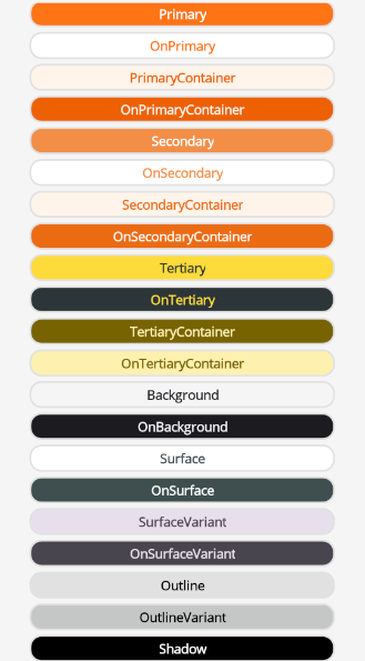
Semantic Definitions of Standard Colors:
- Surface – Used for large, low-emphasis background areas on screens.
- Primary, Secondary, Tertiary – Used as accent colors to emphasize or de-emphasize foreground elements.
- Container – Used as fill colors for foreground elements like buttons. They should not be applied to text or icons.
- On – Roles prefixed with "On" indicate colors used for text or icons placed on top of their paired parent colors. For example, "OnPrimary" is used for text and icons that appear over the primary fill color.
- Variant – Roles ending in "Variant" provide a lower-emphasis alternative to their non-variant counterparts. For instance, "OutlineVariant" is a less prominent version of the outline color.
The standard color resources are as follows. You can use these as a foundation to create your own theme.
<Color x:Key="Primary">#FF7415</Color>
<Color x:Key="OnPrimary">#FFFFFF</Color>
<Color x:Key="PrimaryContainer">#FEF4EA</Color>
<Color x:Key="OnPrimaryContainer">#ED6103</Color>

<Color x:Key="Secondary">#f38e47</Color>
<Color x:Key="OnSecondary">#FFFFFF</Color>
<Color x:Key="SecondaryContainer">#FEF4EA</Color>
<Color x:Key="OnSecondaryContainer">#EB6B13</Color>

<Color x:Key="Tertiary">#FDDB3A</Color>
<Color x:Key="OnTertiary">#2C3639</Color>
<Color x:Key="TertiaryContainer">#786301</Color>
<Color x:Key="OnTertiaryContainer">#fef1b0</Color>

<Color x:Key="Surface">#FFFFFF</Color>
<Color x:Key="OnSurface">#3F4E4F</Color>
<Color x:Key="SurfaceVariant">#E7E0EC</Color>
<Color x:Key="OnSurfaceVariant">#49454E</Color>

<Color x:Key="Background">#F5F5F5</Color>
<Color x:Key="OnBackground">#1C1B1F</Color>

<Color x:Key="Outline">#E1E1E1</Color>
<Color x:Key="OutlineVariant">#C4C7C5</Color>
<Color x:Key="Shadow">#000000</Color>
Auxiliary Colors
Auxiliary colors are used for different scenarios apart from the primary colors (e.g., error colors for dangerous actions).
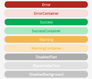
The auxiliary color resources are as follows. You can use these as a foundation to create your own theme.
<Color x:Key="Error">#B3261E</Color>
<Color x:Key="ErrorContainer">#F9DEDC</Color>

<Color x:Key="Success">#01ae54</Color>
<Color x:Key="SuccessContainer">#a8eac0</Color>

<Color x:Key="Warning">#F7B548</Color>
<Color x:Key="WarningContainer">#FFE5B9</Color>

<Color x:Key="DisabledText">#ba919191</Color>
<Color x:Key="PlaceHolderText">#E0E0E0</Color>
<Color x:Key="DisabledBackground">#80919191</Color>
Neutral Colors
Neutral colors are used for text, backgrounds, and border colors. Applying different neutral colors helps establish a visual hierarchy.
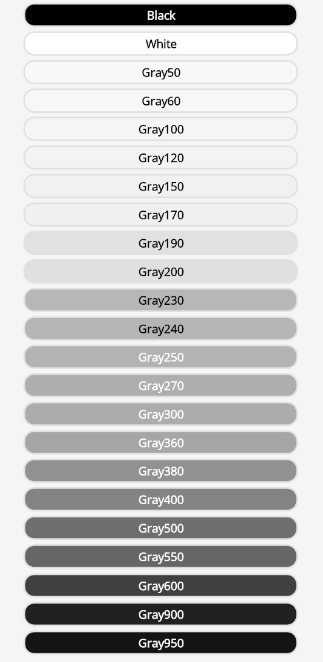
The neutral color resources are as follows. You can use these as a foundation to create your own theme.
<Color x:Key="White">White</Color>
<Color x:Key="Black">Black</Color>

<Color x:Key="Gray50">#F8F8F8</Color>
<Color x:Key="Gray60">#F7F7F7</Color>
<Color x:Key="Gray100">#F5F5F5</Color>
<Color x:Key="Gray120">#F3F3F3</Color>
<Color x:Key="Gray150">#F1F1F1</Color>
<Color x:Key="Gray170">#F0F0F0</Color>
<Color x:Key="Gray190">#E1E1E1</Color>
<Color x:Key="Gray200">#E0E0E0</Color>
<Color x:Key="Gray230">#B7B7B7</Color>
<Color x:Key="Gray240">#B5B5B5</Color>
<Color x:Key="Gray250">#B3B3B3</Color>
<Color x:Key="Gray270">#AEAEAE</Color>
<Color x:Key="Gray300">#ACACAC</Color>
<Color x:Key="Gray360">#A6A6A6</Color>
<Color x:Key="Gray380">#919191</Color>
<Color x:Key="Gray400">#848381</Color>
<Color x:Key="Gray500">#6E6E6E</Color>
<Color x:Key="Gray550">#666666</Color>
<Color x:Key="Gray600">#404040</Color>
<Color x:Key="Gray900">#212121</Color>
<Color x:Key="Gray950">#141414</Color>