VCheckableCollection
A collection of selectable options for implementing multi-selection or single-selection functionality.
Basic Usage
Use the ItemsSource and SelectedItems properties to bind data and selected items.
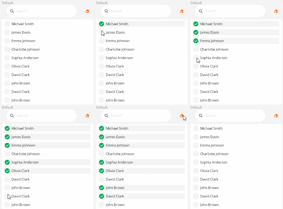
<control:VCheckableCollection ItemsSource="{Binding InternalEmailList}"
                            SelectedItems="{Binding SelectedEmailList}">
</control:VCheckableCollection>
Set the DisplayPropertyName property to specify the displayed attribute.
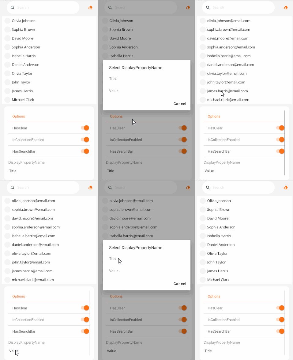
<control:VCheckableCollection DisplayPropertyName="Title"
                            ItemsSource="{Binding InternalEmailList}"
                            SelectedItems="{Binding SelectedEmailList}">
</control:VCheckableCollection>
Search Box
Use the SearchKeywords bindable property to specify search keywords. Items matching the criteria will be case-insensitively and fuzzily matched.
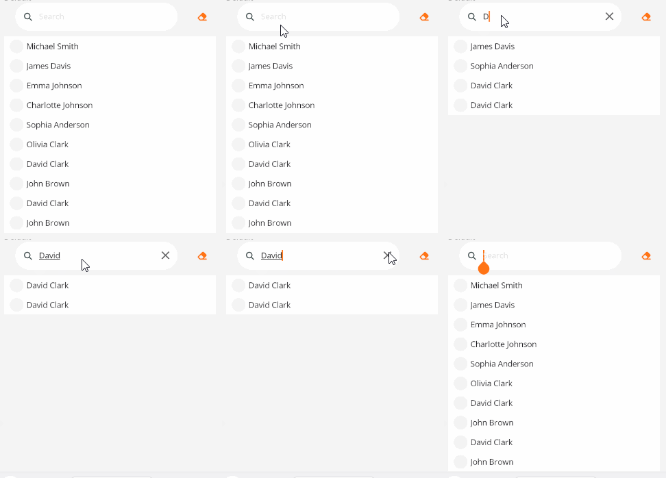
<control:VCheckableCollection DisplayPropertyName="Title"
                            SearchKeywords="{Binding SearchKeywords}"
                            ItemsSource="{Binding InternalEmailList}"
                            SelectedItems="{Binding SelectedEmailList}">
</control:VCheckableCollection>
Single Selection
Set the IsSingleSelection property to True to enable single selection.
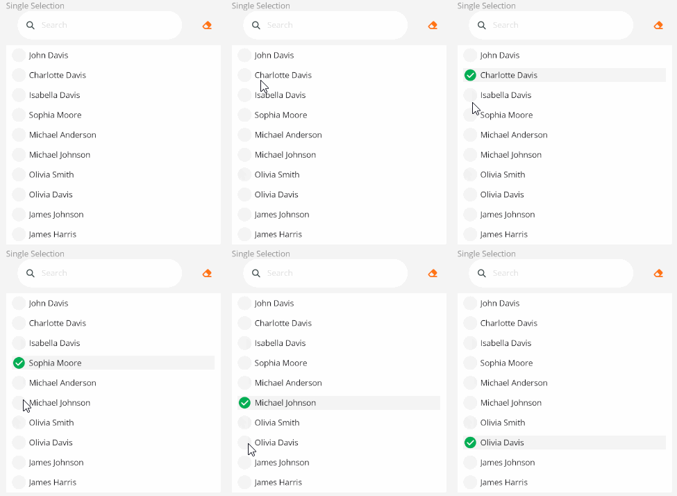
<control:VCheckableCollection IsSingleSelection="True"
                            DisplayPropertyName="Title"
                            ItemsSource="{Binding InternalEmailList}"
                            SelectedItems="{Binding SelectedEmailList}">
</control:VCheckableCollection>
Hide Search Box or Clear Button
Checkbox in an unavailable state.
- Set the
HasClearproperty toFalseto remove the clear button. - Set the
HasSearchBarproperty toFalseto remove the search box.
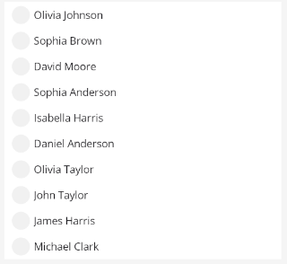
<control:VCheckableCollection HasClear="False"
                              HasSearchBar="False"
                              ItemsSource="{Binding InternalEmailList}"
                              SelectedItems="{Binding SelectedEmailList}">
</control:VCheckableCollection>
Disabled State
Checkbox in an unavailable state.
Set the IsCollectionEnabled property to False.
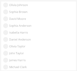
<control:VCheckableCollection IsCollectionEnabled="False"
                              ItemsSource="{Binding InternalEmailList}"
                              SelectedItems="{Binding SelectedEmailList}">
</control:VCheckableCollection>